

The Dance Collective is one of very few dance supplies providers in Egypt, and the only one that provides a wide range of products from the world's top brands.This provided us with a great opportunity to position it as the leader in the market, which added to the importance of getting its branding just right.
I started with a strategy session with the owner to figure out the essence of the brand; going through several exercises to define the target customers, our impact, our personality, and our x-factor: What sets us apart from the crowd.
The Dance Collective provides dance supplies to passionate dancers in an established and authentic environment, allowing them to be confident and have a better dancing experience.
Looking at the competition in Egypt and at similar businesses globally, I found most logos tended to have bright flashy colors, and cursive typography with a little over-the-top swooshes. So, it was easy for me to decide to go in the opposite direction, with a little restraint and elegance.
Sketching ideas, I kept trying to symbolize flow and elegance. From the natural flow of waves, to the dance of the planets around the sun, and to infinity itself. Having done these, I moved on to illustrator.


I worked on several options, but my favorite was this one. It was a neat idea, and encompassed the brand promise of quality and excellence. However, the owner found it too corporate and impersonal, which, in hindsight, I agree with.
So I went back to the drawing board, trying several icons, but nothing seemed to fit right.


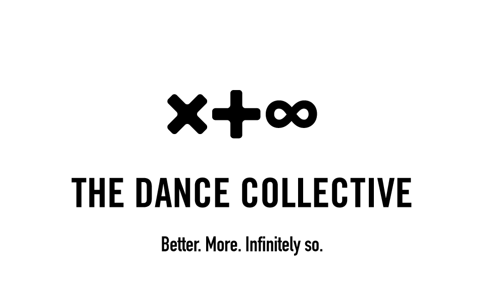
Then as always with hard work, inspiration hit me, we realized that the infinity symbol looks like 2 dancers entwining their hands together. With that epiphany, it was only a matter of perfecting the form of the dancers.

Moving to the typography was a much simpler nut to crack. I settled on Akzidenz-Grotesk Condensed, to add a solid and compact feel that compliments and grounds the flow of the icon.


This was one of my favorite projects to date. Months later, I still smile whenever I see the logo and feel like having my picture taken with it. If you're looking for your new logo design, shoot me a message on my email: mnasr.design@gmail.com. Let's create something beautiful that works!
Website designed and built from scratch by yours truly.